“Elemental” Spirits
Bottle Label/Branding Concept

The bottle design for the alcohol/spirit company consists of three cohesive yet distinct designs, each with the goal of representing a unique flavor experience. Utilizing a minimalist approach, the bottles feature a sleek, matte finish that serves as a canvas for the brand's emblematic logo in a subtle, embossed detail.
In Illustrator, I created vector graphics that served as embellishments for the overall brand identity. My proficiency in vector design enabled me to produce scalable artwork that maintained its quality across different media formats. This part of the process taught me the importance of clean lines and color consistency, as well as how to effectively use shapes and gradients to enhance the visual appeal of the design.
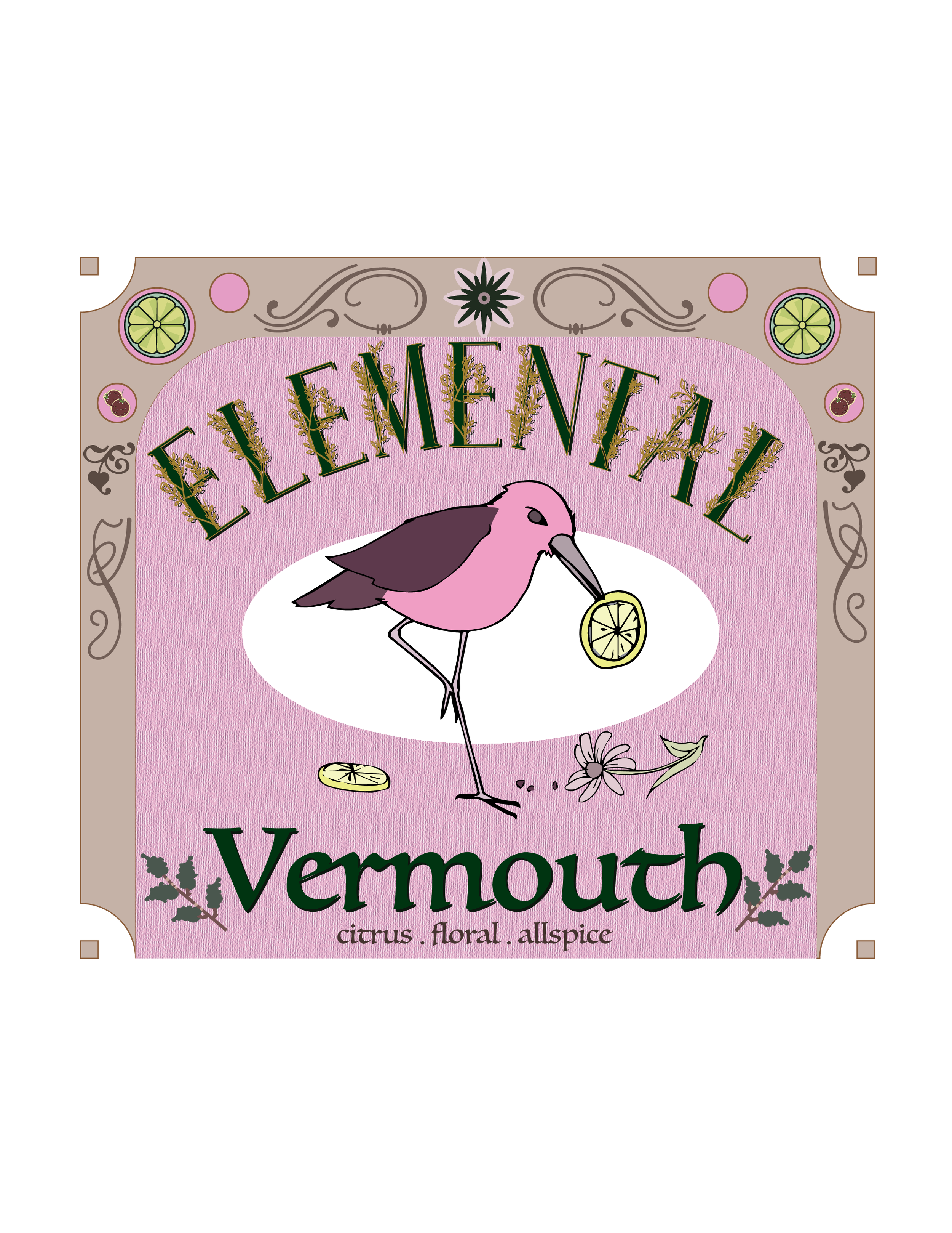
The second bottle, highlighting an herbaceous, citrus-infused vermouth, is draped in fun, vibrant tones with a textured label that evokes a sense of warmth and indulgence and design elements that emphasize its unique ingredients.
Through this project, I learned the significance of integrating various design elements cohesively. Balancing traditional illustration techniques with modern digital tools expanded my creative toolkit and reinforced the value of versatility in design. Additionally, I gained insights into the branding process itself, understanding how visual elements can communicate a brand's message and identity effectively. Overall, this experience has solidified my skills in both software applications and my approach to developing compelling brand narratives while using my personal illustrative touch.
For this branding project, I utilized a combination of skills in both Photoshop and Illustrator. In Photoshop, I traced uploaded pen illustrations, which required a keen eye for detail and a solid understanding of layers and paths. This technique allowed me to transform hand-drawn elements into polished digital graphics, ensuring they retained their artistic integrity while also being suitable for various applications.
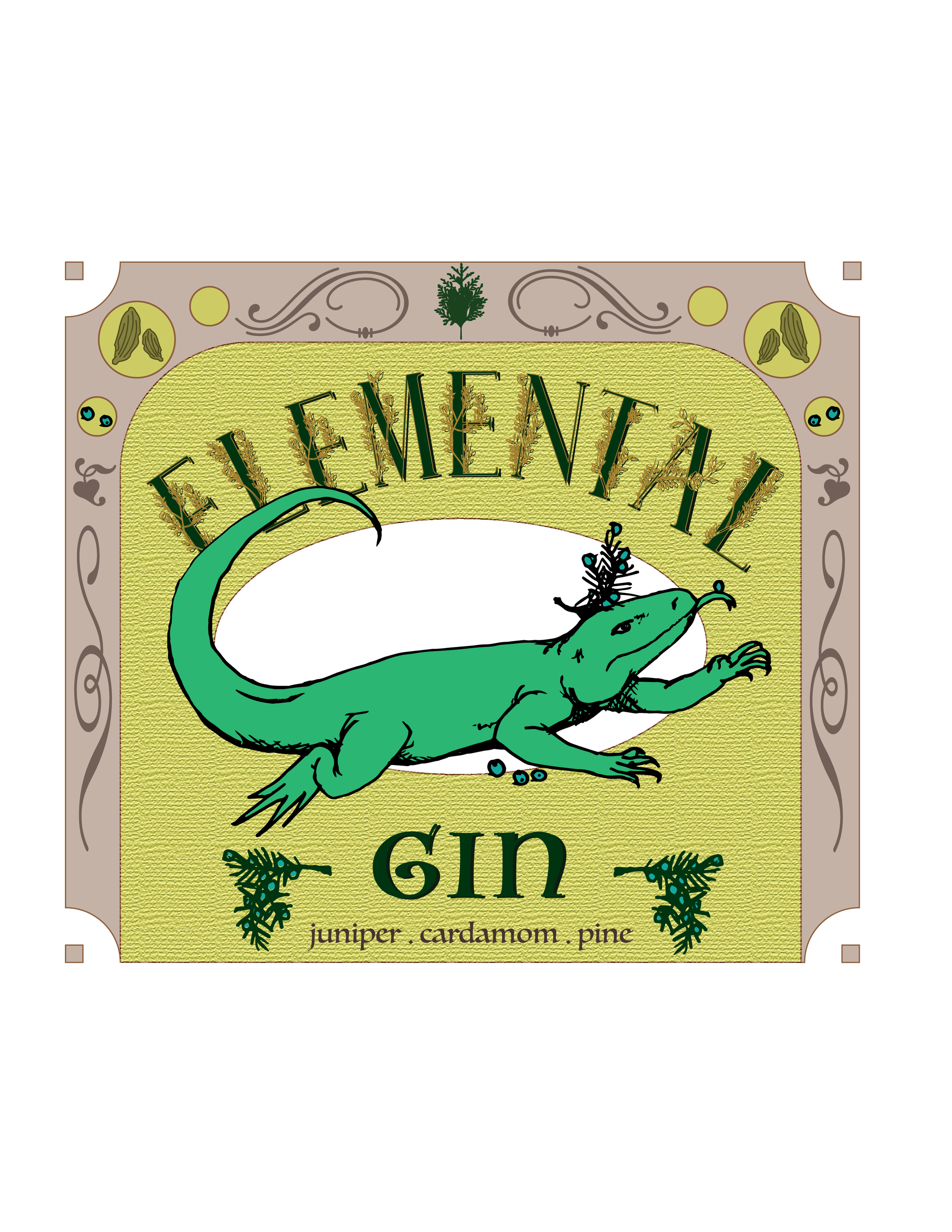
The first bottle, showcasing the crisp juniper flavor of gin, is adorned with natural, botanical-inspired hues that suggest freshness and rejuvenation.
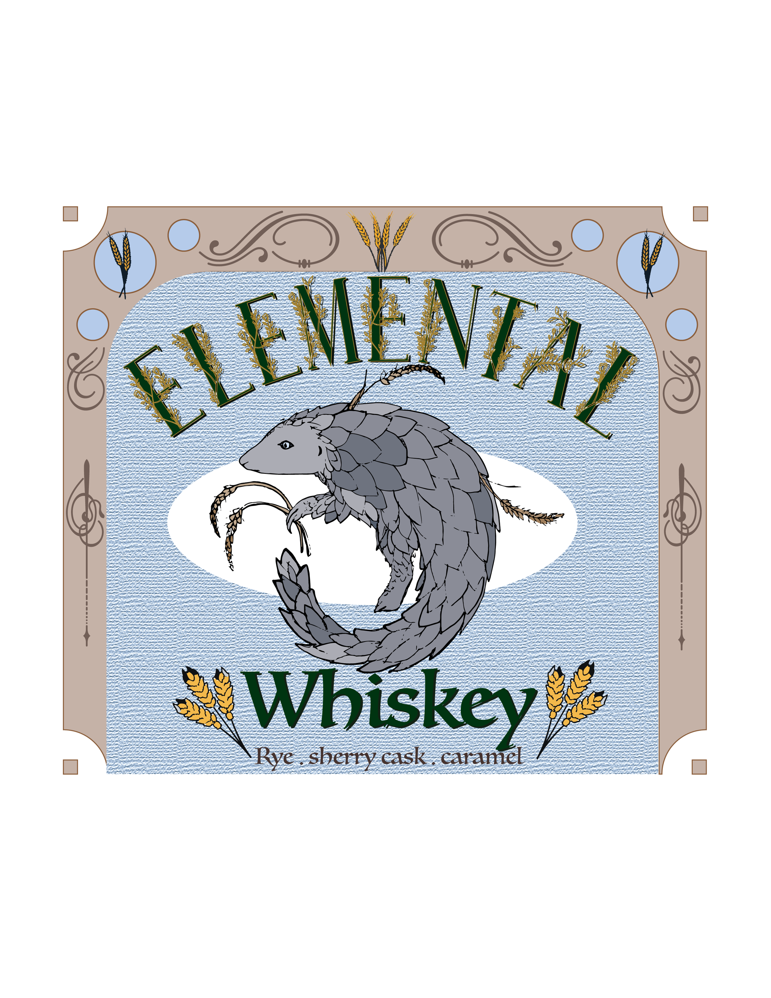
Finally, the third bottle, representing a smooth blend of an iconic spirit (as well as one of my personal favorite animals), incorporates fresh green accents and intricate illustrations, emphasizing its classic rye-forward flavor.
Together, these designs not only reflect the essence of each flavor but also create a striking visual harmony on the shelf, reinforcing the brand's identity while enticing consumers with a tantalizing glimpse of the spirit within.