Symbiosis
Beer Can Label, Senior Project 2024
At its core, Symbiosis was an exploration into label design, but with a homage to history and the natural world. I included elements of ancient Greek vase storytelling, while using modern day typography and my own illustrative design to convey two stories within the confines of two aluminum cans; each derived from a lifetime in the Pacific Northwest and the awe-inspiring ways in which it keeps itself in check. Left piece titled “Marine Derived Nutrients”, and the right, “Pollination”.


From beginning to end, I knew I wanted to incorporate both my love of the Pacific Northwest, and love of Graphic Design. I was interested in combining my illustrative abilities with simple typography to create an eye-catching product.
I used a monochrome palette to emulate ancient Greek designs and challenge myself, and to tie both designs together.
At the time, I was working in a brand new restaurant in downtown Tacoma, of which the owners themselves were brewery owners. We worked together to discuss the best way to create this product without the use of bulk ordering.
We ended up with the simple solution of borrowing a few of their empty cans and printable sticker labels.
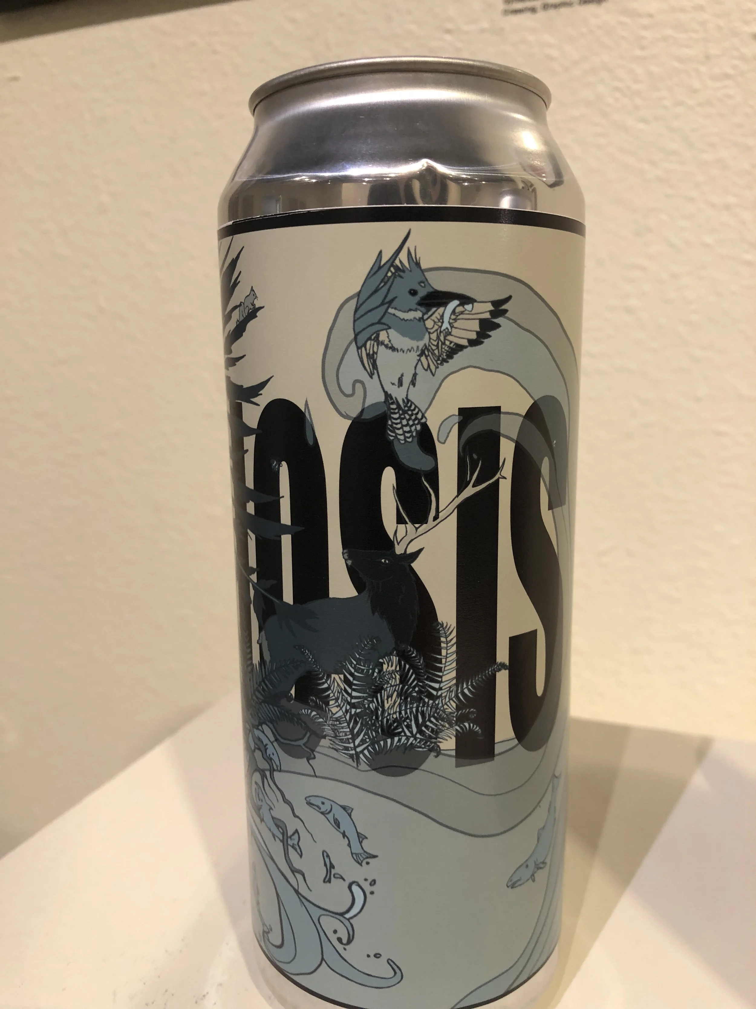
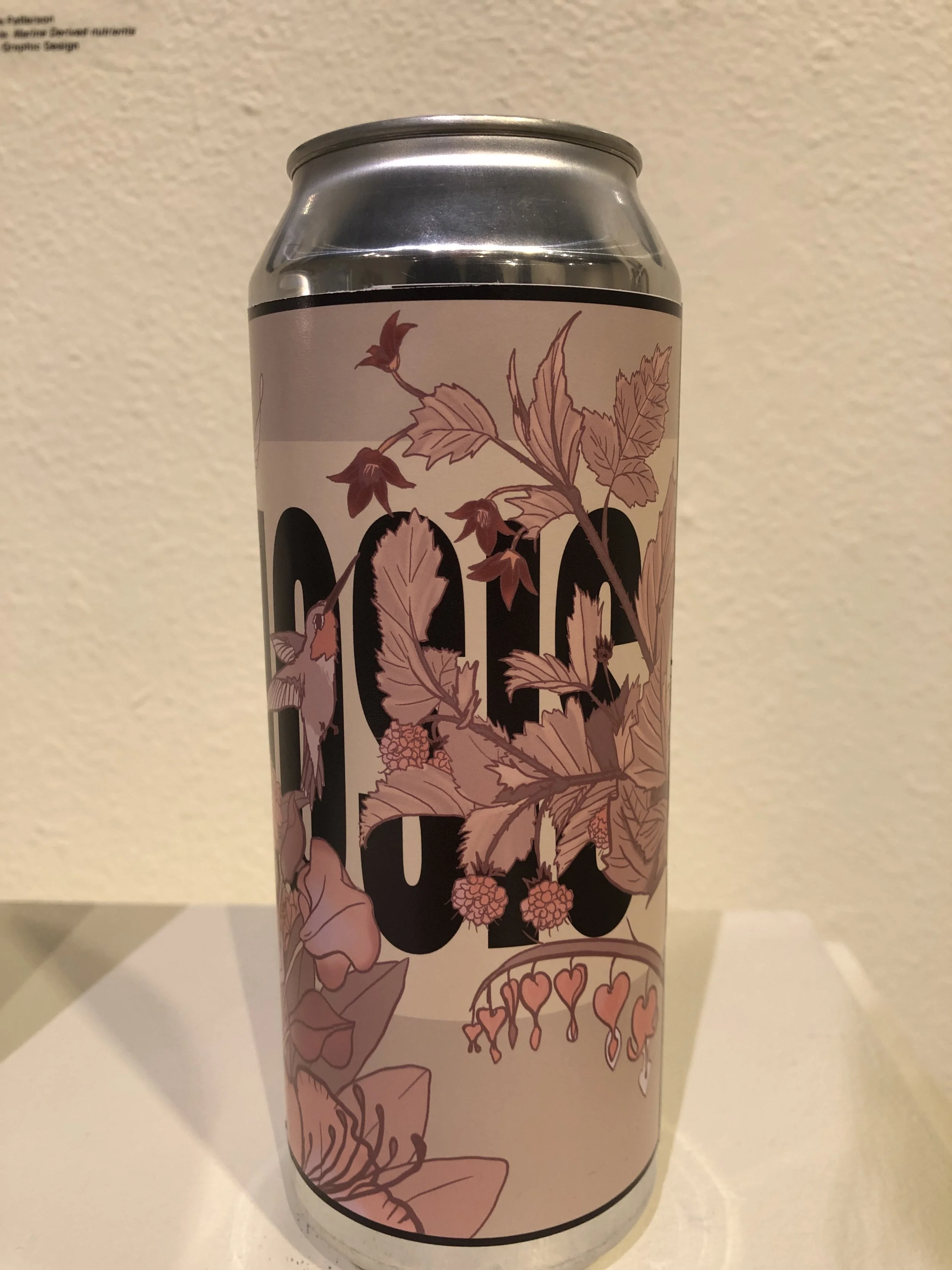
I was able to use all of my skills in one project. I started with illustration sketches, moving to Procreate, transferring and finishing the designs in Adobe Illustrator and Photoshop, where I added the text and vectorized the art, fine-tuning lineart and color. I then readied them for printing onto a sticky-backed label paper specifically outfitted for a 16 oz. aluminum can.
The final product included both two can labels, as well as two framed high-quality prints.


